Friday, 5 May 2017

Main Task: Organisation and Risk Assesment

Organisation


Actors
  • James Donovan
  • David Hutchings
  • Dean Curran
Props
  • guitar
  • drums
Costumes
  • red shirt
  • grey t shirt
  • jeans
  • trainers
  • coat
  • leather jacket
Risk Assessment
Green screen
  • don't break equipment
  • don't break lights

town
  • don't fall in river
  • don't lose each other or get lost
  • don't get into trouble with strangers


Wednesday, 3 May 2017

Prelim Task: Justification of my choices

Justification Prelim Task

In our prelim task we had to design and create our own collage magazine, this is so we could develop and improve our own skills in the likes of Photoshop and Indesign. We used Photoshop to create and altar our own images, I learned how to change the likes of the filter and brightness of my images as well as remove marks and spots from peoples faces using the 'Spot Healing Tool' I also learned how to crop people out of background using several different methods, these included; highlighting the person and erase the rest of the image, use the lasso tool to crop them out or selecting the person then selecting 'Inverse' and deleting the rest of the image. While not much, the skills I learned in Photoshop was a start for getting me used to the software and preparing me for the main task. As for Indesign, I learned how to layout a magazine, learned how to use columns, as well as place images into the page and scale them effectively. This was a decent start since there is not much I needed to learn for Indesign since it is a simple software to use. (once you learn how to use it properly)


Tuesday, 2 May 2017

Feminism

Feminism
 
 
Feminism is originally the movement that fights for equality between men and women.
The feminist movement began in the 19th century, this is known as First Wave Feminism, where women protested against the inequalities women faced in the 19th century, such as being denied education, being forced into marriage and only being allowed low rank jobs like factory work or being a servant/maid (if they were lucky)
During WW2 women had to work in factories and farms making supplies for the soldiers, through the majority of the 1900s women fought for equality with men in terms of pay, work and respect. They soon got there wish in most parts of the modern world. woman can now work in any job (provided they have the qualifications) women can receive high end education such as university, woman can marry whoever they choose and keep custody of their children if they divorce their husband.
 
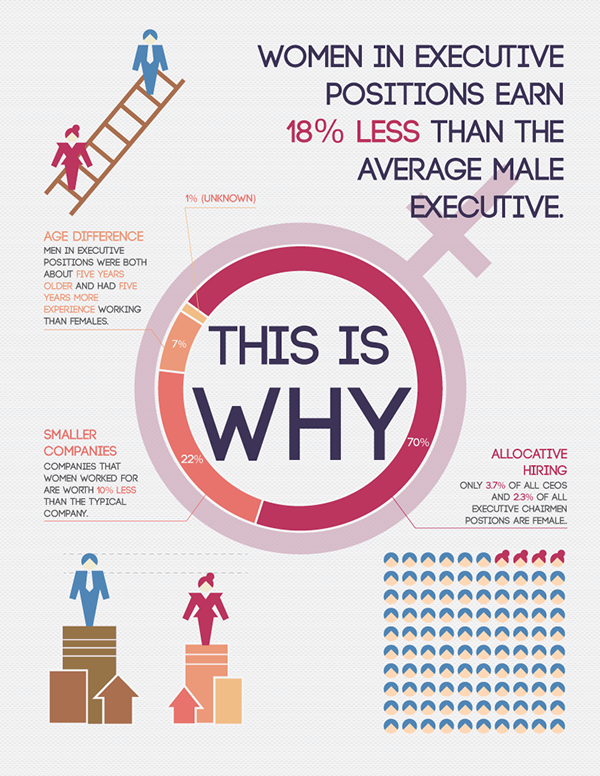
However modern day Feminism has become more a protest for advantages against men, people believe it when they pull the "Equality" card because of feminisms progressive history. There is a common myth which a lot of people believe known as the gender pay gap, where men are payed more than women. However this has been debunked countless times by bankers, accountants and other economic majors. Feminists ignore facts of occupation, hours worked, taxes and other factors that effect every person differently, instead they yell "OPRESSION" Not only that, it is illegal to pay someone less for doing the exact same job under the same conditions.
 
Modern day feminism has become more of an "eye for an eye" movement rather than a movement for equality; Men, Whites, Straights and other majorities or ethnic groups that haven't face oppression based on their ethnicity in the past are demonised as the problem in society.
 

Image result for milo stewart meme

Friday, 17 March 2017

Evaluation

In this post I will be demonstrating how I made my documents for my evaluation, used the software and tech at my disposal as well as what I have learned while making these projects and how I feel about my final product.

Green screen Video
First I recorded a video of me, answering my question, in front of a green screen, on my phone and later emailed the video to my school computer then I edited things into the green screen behind me depending on what I said


Lip Sync Video
First I recorded audio from my phone, of me answering the question, then I placed an image of a cartoon character (Stitch) into Sony Vegas. then I created two different mouths for stitch, one open and one closed, then I would place an open mouth on stitch whenever audio was there and a closed mouth when nothing was being said (and in between words)


Slide Show
Here I created different slides of the answer to my question in Photoshop and then put them into Sony Vegas

Cartoon
This cartoon I made in Sony Vegas and Revelation Natural Art. In revelation you create each frame individually, then time them to be slow or still at points and fast at others. for example the video would remain still while I was talking and it would continue while I was silent. I saved the cartoon as  Gif, then imported it into Sony Vegas where I added my audio in afterwards. I rendered both the Gif and audio then my cartoon was complete.

Audio Log
I did my final question as an audio file, I created this using Sound Recorder, I improvised most of my audio since I felt like I should convey honesty rather than a scripted monologue to end my Evaluation.


Split Video
This Video was by far the hardest to make, due to technical difficulties. Firstly I recorded two separate videos both asking and answering my question, then we had to import them into Sony Vegas. However this didn't work at first since the file format these videos were in wouldn't upload to Vegas, therefor I had to wait weeks before the video could be fixed.  Then I placed both videos in to overlap one another then altered the brightness and transparency to make them both viable. Unfortunately because I was pressured for time I was unable to make the videos clearer, they both have a faded/transparent tint to them but I find it acceptable due to the circumstances.
 (Just pretend that they are the ghosts of a dead schizophrenic) 


Thursday, 9 February 2017

Media city

Media City

We went on a trip to the BBC Media City in Solford. They had extremely expensive equipment that was able to connect to the other Media City in London down the Line. 


They owned cameras that cost around £150,000 each, that had high quality video recording and the cameras and equipment were for professional use. They also had a screen that displayed the weather which whoever was doing the weather that day would stand in front and do the weather live, we also had a demonstration on how short notice the weather is, the weather man or woman would plan a segment that lasted around three minutes and would be called by the studio that they would only have one minute to do the weather to meet the rest of the schedule, this shows how stressful it would be to work in the news and weather industry.

We also had a tour of the studios that they have for any TV shows that they show on BBC, the studio was an empty room which was large enough to store large sets and even an audience of over a hundred people. This shows the scale and recourse needed to make a TV show as well as the amount of time, rushing and planning that would be needed to make these shows at a decent schedule.
  

This trip was an interesting day, it taught me a lot about what goes on in the media industry, the effort and cost that goes into making the media we see today on the TV, news and internet, I had fun with my colleges as this was a decent way to bond with them which will effectively make working with them a lot easier and a lot more fun. It also prepared me for the work to come, all of the methods and theory's i will have to study, all of the equipment I will have to take note on, the technical terms and the coursework and editing skills that I will have to pick up.   


Friday, 27 January 2017

Evaluation Essay

7 Questions

Who would be the audience for your media product?
My target audience for my Music Magazine is rock fans, more specifically moody/dark rock, but a secondary audience could be indie fans since the contents of my Magazine don't specifically detail Rock content. Another demographic could include the working class since one part of my magazine features an interview with one of the artists featured, they state how they do their music because it is their passion and they are not interested in money or fame. This could gear towards the working class because the higher classes generally seem to be interested into money and fame while the working class generally believe in passions and dreams. My Magazine most likely attracts the younger generations since there aren't many people in their middle age listening to moody rock music. My magazine is mostly geared towards white people because the majority of people featured in the magazine are white and the genre is stereotypical geared towards whites. Another demographic which could isolate most of the world is the fact that my magazine is in English only, so the magazine is only for English speaking countries.

How did you attract/address your audience?
The images are dark, edgy and mainly consist of monochrome or Threshold images, this suits he dark/edgy theme of my Magazines Genre. the contents are Music and band based so the contents could attract both music fans and fans of celebrity gossip. The cover of the magazine has a banner that says 'Exclusive content' which would attract people who want to know things that most suppliers of similar information wont give.  My cover doesn't include music related images so people would be interested in the unique style compared to the other music magazines on the shelves.

How does your media product represent particular social groups?
My Magazine represents its audience as dark or edgy since the style of the images are dark and dreary, also the typography features fonts which also seem dark and Gothic. It also represents my audience as passionate about bands and music, this is because one of the bands featured explains how they would use their music to follow their passion instead of making money, the magazine also describes the backlash from the fans of a band who decided to change their style, this shows how passionate my audience is represented.

What have you learned about Technologies from the process of constructing this product and why?
In Photoshop I have learned how to use many tools and how to use them effectively, this includes the likes of many different brush pre-sets, the magic wand tool which I used to select certain parts of images and alter them without ruining the rest of the image or altar the rest of the image without ruining the selected part, I learned how to change the colour of an image, the brightness, the contrast, add fonts and create thresholds as well. Indesign is what I used to design and create my front cover, double page spread and contents page of both my magazine, I learned how to use the codes and conventions that are common in magazines effectively such as large mastheads and how to grab the readers attention. We used the internet to study and research many different types of music magazines as well as the codes and conventions present in most as well as those not present in certain magazines, we used this to see what suits certain genres, the use of the internet has allowed  me to develop my analysis skills. PowerPoint allowed us to create documents such as slide shows, but we also used it to store screenshots of our work progress which we would then turn into JPEGs on Photoshop then put on our blogs. I also used my phone to  take pictures which I would then alter on Photoshop, the phone has allowed me to develop my photography skills such as lighting, camera angles and focus. Finally I used email to share and pass on work to myself and my colleges, this has helped me to work around certain situations and made it easier for me to pass on my data.

In what ways does your media product use, develop or challenge forms and convention of real media products?
My media product both follows and challenges the forms and conventions of traditional music magazines (that I studied) My front cover includes a large masthead which is designed to catch the readers eye, has cover lines that go down one side of the page, has a title that mentions the content of the magazine, All of these are traditional forms and conventions. The central image challenges the forms and conventions that were common in the magazines that I studied, my image has no mention of the fact that its music based, I did this so it would be different from the other magazines, so it would stand out, so people would buy it because of how different it is. My double page spread features a main image and two other images which are surrounded by text, this was common in the majority of double page spreads that I studied since they found a way to balance out the images and text, my images are also music related so it follows another traditional form/convention. My contents page mostly follows the traditional forms and conventions and it is similar to the layouts of the other contents pages I studied, my contents page has the contents labelled with large page numbers so they catch the readers eye, the typography follows the genre that is present through the rest of the magazine pages and there are eye catching images that make the reader want to keep on reading.

What kind of media institution might distribute your media product and why?
A media institution that might publish my media product is Bauer Media Group, which owns Kerrang. This is because Bauer publish many different types of music media products, such as magazines, all around Europe including the UK. When I was studying other magazines some of the Magazines was from Kerrang, so my product, which is based off of products by Bauer Media Group, should have a better chance of being published by them.

Looking back what have you learned in the progression from prelim to your full product?

In my prelim task I had not much experience in Photoshop or InDesign, I could barely place an image effectively into a document, I had no idea how to use the many tools in Photoshop, I wasn’t aware of the different uses for the codes and conventions since my analysis skills were weak and I didn’t even include cover lines in my front cover, any content in my double page spread, the only thing that was decent about my contents page was I placed a background and had a large title. I had a lot of practice and gained a lot of skills while creating my Main Product, the music magazine. While making this I had plenty of research and analysis from other music magazines as well as different genres of music magazines, this also allowed me to analyse the different uses of the codes and conventions as well as how to follow them or go against them. I learned how to use the tools in Photoshop more effectively, like the magic wand, lasso and marquee tools to select and crop out certain parts of images, I learned how to use different Brush Pre-sets to create my own unique patterns to go with my magazine in backgrounds etc. I also learned how to navigate the essentials better, for example I now know how to use the ‘select’ bar and 'Image' bar, I used these to select the likes of inverse if I needed to alter a certain part of an image and to edit an image entirely.   

Friday, 20 January 2017

Introduction to breif

James Donovan Introduction to Brief
This is my first introduction to Media, as a subject, since I did not do Media as a subject in my GCSE's. I gained an interest in media because it molds the very shape of our society; Movies and Television and the Entertainment industry make trends and shape our pop culture, News and Politics give information and tell the world whats going on around them. However another reason Media interests me is how it influences ethnic groups and creates division among the people, media is used to spread "news" which is only what they want you people to see, fear and suspicion sells. This heavy influence on information also is used to control people, fuel the flames which is used to get politicians  into higher places, based off of the fear they have created (for example George Bush after September 11th) But media also interests me because it has a large influence on the film and entertainment industry, which is the main reason why I took this course, because of my interest in the movie and acting industry. I also thought that it would be a fun subject, designing magazines and learning how to use the likes of Photoshop could be enjoyable compared to the traditional writing style of most lessons. 


Tuesday, 17 January 2017

Main Task: Interview with my target audience

Interview with my Target Audience


This interview was taken with Dean Curran and David Hutchings

Front Cover: The first question was about the colour of the cover. It was described as being dark and shady, which suits the theme of my magazine, the use of red was connoted as symbolizing blood or danger. The second question was about the typography. The title and Masthead stand out with the black/white 3D effect, I did this so it would stand out more on the shelves (so it would literally pop out) it suits the cover image with the use of Gothic text and also suits the moody rock theme. Some extra comments included; they both like the use of threshold on my central image, the cover lines could be stronger and bigger and it could look cleaner and more professional. While vague the advice to make the cover more professional was useful since I decided to add a banner to the cover after that, since most covers I studied included a banner (if the masthead didn't cover the very top of the cover)

Double Page Spread;  The first question was about the colour of the pages: it was described as being bland, compared to the rest of my pages which included a lot of colour but the one section of colour placed behind my text was decent and similar to the rest of my pages, I just needed to make it bigger. The Typography doesn't match the rest of the magazine, I believed showing contrast between my pages would allow for the pages to seem more appealing, I was wrong. so I got the same fonts as my front cover and contents page, The images images were nicely edited but needed more with colour, I believe that the black and white images should stay since it suits the theme of the magazine and contrasts the other pages, which both include colour. Because of my feedback I decided to make the red and black pattern behind my text bigger, changed the position of one of my images as well as changed the font of my title to the same as my  front cover (or something similar)


Contents Page; Firstly the colour matches the rest of my magazine and was used effectively to separate different texts as well as made the background more appealing, but the red box (behind one of my texts) felt out of place since there was a red/black pattern placed behind it, so i made the text bold and white so it would be easier to see in front of the pattern. The typography was good since they were similar to the front cover but the contrast between the texts doesn't suit the page well, the titles are good and similar to cover, since they also include a 3D effect which makes the page stand out. The images create atmosphere and show that its a music magazine well as well as shows the genre due to the colour effect on guitar (coloured guitar with a black and white background behind it)

Wednesday, 11 January 2017

Main Task: Music Magazine Contents Page Final Product

James Donovan Contents Page (Final)

This is my final product for my Contents Page:


For my layout I tried to make this page more organised and 'boxy' instead of the way my other pages were laid out, this makes this page different from the others yet follows the same themes and style as the other pages, this is also laid out similarly to another contents page I have studied, it was highly information based yet was vibrant and colourful. From the feedback I received I tried to make sure I kept a similar colour scheme as the rest of my pages, I added an image which showed that it was a music magazine since the rest of the images in my magazine mostly consist of actors. I made sure the typography was similar to the rest of the magazine (similar fonts, colours and effects) In the end I think this contents page turned out well, It has went through a lot  of changes and has been developed into a contents page suitable for my music magazine. 

Main Task: Music Magazine Double Page Spread Final Product

James Donovan Double Page Spread (Final)

This is the Final product of my Double Page Spread


I started with my Image, I decided to keep with the same theme as my front covers central image by making the image a Threshold, but this time I made the image black and white to make it different from the cover. I also made my title try to stand out as much as possible, without it colliding with the text and images. So I made one part of the title 3D (like the masthead on the cover) but the other part in colour and 2D, this is to add contrast in the typography, it is also similar to another double page spread that I studied, this page featured a title that was a quote from the artist featured in their magazine, their titles typography was also similar to my title since it also had contrasting fonts and colours in each word. For my text I featured an interview with the artist featured in the main image, to make it stand out I originally placed black boxes behind the text but it wasn't appealing to the eye and looked out of the place from the rest of the page, instead I created my own pattern in Photoshop out of red and black brush presets, this was to make the boxes similar to the colour scheme on the cover.  

Main Task: Music Magazine Front Cover Final Product

James Donovan Front Cover (Final)

This is the final version of my front cover.


I decided to use rock as my genre, the style of rock I was looking for was moody and dark. The Central image is a Threshold, I chose red and black because they both add a dark yet artistic use of colour to the cover when used together. The Masthead is supposed to be large, bold and eye catching in order to stand out, all of the mastheads I studied from other music magazines featured a large masthead that went across the top of the page, the best ones (in my opinion) were in 3D, so I added a shadow affect by copying a white version of the masthead and placing it over the black one, this created an effect that added to the theme of the cover as well as made the masthead stand out without looking odd or out of place. I used the same method for my Headline which is smaller and placed in the middle of the page.  I tried to make sure the headline didn't collide with the main parts (the models) of the central image so I placed it where nothing else was placed rather than having empty space. The Cover Lines and Banner are not as bold as the masthead and headline, this is to add contrast between the texts, the uses of fonts and scales make the typography stand out. 

Tuesday, 10 January 2017

Questionnaire Results

For my questionnaire I asked 15 people to look at three front covers of music magazines, based off of different genres of music.

The first question asks about the age of the viewer: the majority of people answered 10-16. a couple people answered 17-20 and a few others answered 31-40


The second question asks the question (which would be the basis for the rest of the questions) which front cover was their favorite... I have created a pie hart displaying the result I received.
Question 3 asks if the typography grabs the readers attention, most people who answered put yes, mostly due to the sizes, fonts and colours. 

Question 4 asks if the central image is interesting, those who chose rolling stone as their preferred cover mostly answered yes due to its creative/unique style.

Question 5 asks if the colour of the made their proffered magazine made the magazine stand out, most people answered yes but one person answered no; their preferred magazine was form Classic Rock which has an image of Axle Rose in front of a black screen, so can agree that there is a lack of colour (comparing to the other covers)

Question 6 asks if the magazine is considered eye catching, most people answered yes due to many different reasons. People who chose RollingStone mostly said it was because of the collage style and creativity, people who chose Classic Rock said it was because of the artist used in the central image, the person who chose Metal Hammer said it was because of the genre of music.

Question 7 asks if the layout of the page is decent, all of the covers have a similar layout; a central image with a direct mode of view, cover lines on each side and a large masthead that goes across the top of the page. So everyone who took the questionnaire answered yes 

Question 8 asks who the target audience for the selected cover is, most people, who chose RollingStone or Classic Rock, said it would most likely be fans of the artist featured in the central image.

Question 9 asked if the central image is appropriate for the cover, most people answered yes  because they all featured an image of the artists in the headline. 

Question 10 asks what does the headline say and what does it mean, the covers all talk about the artist featured in the image, but RollingStone's headline is different, it calls Jay Z the 'king of america' meaning hes successful or at the top of his game.

Question 11 asks if the cover features enough information about the contents of the magazine, all answered yes, because all three of the covers feature a decent number of cover lines.