Semiotics: we are studying semiotics which is the analogy of certain things and how they can be interpreted.
Allegory: anything that can be interpreted with different meanings by different people.
Analogy: comparing one thing to another, pointing out the differences and similarity's they both have
Metonymy: certain attributes belong to different things such as; a businessman would wear a suit
We are studying semiotics as it will help us gain an advantage in the content we create for media, since we will be able to see how different people will interpret our work and we can think about the pros and cons of what we make before we publish it.
Semiotics also effects how we see symbols, metaphors and actions.The connotations are not always the same as what the publisher has denoted since people don't always perceive what is originally intended due to; misunderstanding, gender differences, cultural differences and peoples levels of sensitivity towards certain subject matters.
Tuesday, 22 November 2016
Sunday, 20 November 2016
Main Task: Thumbnails
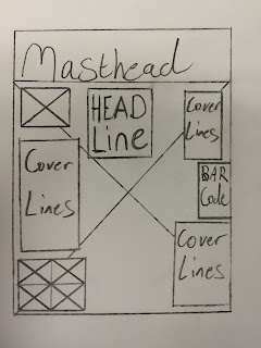
These are images that were hand drawn by me, these images are Thumbnails of Magazines that we have studied. The pages include Front Covers, Double Page Spreads and Contents Pages. We are using these for inspiration for our Music Magazines that we are designing. I have to analyse these thumbnails and take all of the 'Codes and Conventions' into consideration.


TBC
Thursday, 17 November 2016
Main Task: Greenscreen Photos
For These images it was our task to take pictures of each other in front of a green screen, this is so they can be Photoshoped to have backgrounds or to use other skills to create images for our Music Magazine. TBC


Main Task: Music Magazine Planning
These are several pages from Magazines which caught my eye, I analysed them and picked out things that appealed to me, analysed all of the codes and conventions and used these to plan out the pages of my Music Magazine.
This first image is of a front cover by Classic Rock, which features Aerosmith as its headline and central image. The use of this band is what first attracted me to this front cover, this shows that this cover is designed to attract fans of this band and the same genre of music. The Masthead is in large, bold writing which stands out from the rest of the cover, even with the central image colliding with the masthead, it is still easy to read due to the typography. The cover lines feature a variety of colours and fonts in order to highlight key elements and to separate the titles from the information.


This first image is of a front cover by Classic Rock, which features Aerosmith as its headline and central image. The use of this band is what first attracted me to this front cover, this shows that this cover is designed to attract fans of this band and the same genre of music. The Masthead is in large, bold writing which stands out from the rest of the cover, even with the central image colliding with the masthead, it is still easy to read due to the typography. The cover lines feature a variety of colours and fonts in order to highlight key elements and to separate the titles from the information.

This image is of a Contents Page again by Classic Rock. This Page appeals to me since it separates its central image and its text in order to avoid collision with each other and to make the page easier to read. The central image I also find interesting; the use of the band Rolling Stones would attract fans of the band and its genre, the old photographic filter adds an artistic feel to the image. the contents themselves are numbered with red numbers which makes them stand out from the rest of the text.

This is a Double Page Spread by Kerrang. This page appeals to me due to the dark backgrounds and images which highlight the text, making it easier to read. The images include the band 'My Chemical Romance' this would attract fans of the band as well as fans of the genre. The typography also appeals to me; it uses a variety of fonts and colours to make certain parts stand out from the rest of the page, The page uses both white and red text to highlight certain parts of the page, such as the titles of the cover lines. The use of monochrome and red makes the page seem dark, similar to the style of the band featured, I intend to use a similar colour scheme for my magazine pages.

Tuesday, 15 November 2016
prelim task: college magazine (photos)
These Pictures were taken during our lesson, we had to use these in order to make our 'college magazine'. We created this college magazine with a; 'front cover' 'double page spread' and 'contents page' this is so we can get used to using Photoshop and in-design. This is a list of all the photographs we were allowed to use for our College Magazines as well as who is in these photographs.


This image features most of our Media class; James Donovan, David Hutchings, Alex Connors, Joe Spellman, Sam Crummey, George Martin,

This image features; James Donovan, David Hutchings, Alex Connors, Joe Spellman, Sam Crummey, George Martin,


This image features; David Hutchings, Alex Connors, Joe Spellman, Sam Crummey, George Martin,

This image features; avid Hutchings, Alex Connors, Joe Spellman, Sam Crummey, George Martin,

This image features; James Donovan, David Hutchings, Joe Spellman, Sam Crummey


Subscribe to:
Comments (Atom)