This is my original image which I edited to be my central image for my Front Cover.


Then I wanted to make the image look
something like a stencil, I did this by selecting
'Threshold' in the 'Image' tab.

This is the Final Product of my 'Central Image'. I made the image Red and Black by firstly selecting a section of white with the 'Magic Wand' tool, then going into 'Select' then clicking 'Similar' this highlighted everything that was white. Then I used a brush toll with the desired shade of red and coloured in the image. Since the white parts of the image was highlighted with the magic wand the parts in black wouldn't be affected by the brush.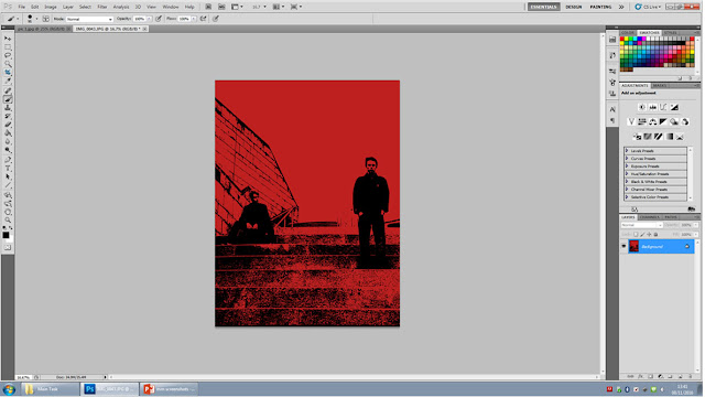

Firstly I placed my image into the Background by making a box with the 'Rectangle Frame' tool then selecting 'File' then 'Place' and finally picking the desired image.


Here i decided on the name of my magazine as well as the Headline and the name of one of the "Bands" that will be featured in my magazine. I picked "The Abyss" as my Masthead because it suits the dull and 'edgy' theme I wanted.
Here I added and image of Davids face
in order to fill up some of the empty
space, eventually i decided to remove it
since it seems out of place and it adds
nothing to the cover worth adding.

Here I added a Graphic Feature stating that there is exclusive content in the magazine, this would attract people who wanted to find out news that other magazines don't cover. I also added my cover lines to the front cover with stories about the "Bands".

Here I decided to make the Masthead bigger, this is because every Front Cover we have been studying has featured a large, bold and visually appealing Masthead. I had an idea to copy and paste a white version of the Masthead then place one over the other to add a 3D affect.


This is the Final Product of my Front Cover; I did the same with the Headline as I did with the Masthead, copying and placing a black copy of the Headline and placing it behind the first to add a shadow affect, Then I made my cover lines fit onto the stairs in the background.
No comments:
Post a Comment