This is how I designed my Double Page Spread, I used Photoshop and Indesign to create this document.
This first image is of me, we took this picture in town. Firstly I removed my spots, blackheads and any other marks with the 'Spot Healing' tool. Then I made the image monochrome by selecting 'Image' then the 'Black/White' option.
This next image is of David, we took this picture in the green screen room, First I made the image into a Threshold; I did this by selecting 'Image' 'Adjustments' then 'Threshold'. After that I removed any of the shaded parts of the green screen by selecting them with the 'Magic Wand' tool then colouring the selected parts in white with a brush tool.
Here I added my Background to my Double page spread, I chose this image because the Threshold is similar to my front covers image. I also started to add my basic text (meaning where I roughly plan to put my text)
I began to add my actual text as well as boxes that would be placed behind the text, making it stand out. I put the boxes behind the text by making sure the text is at the front, I did this by right clicking on the text box then selecting 'Arrange' then 'Send to front' I also added a couple of my images but removed one of them since I wanted to place it on my contents page instead
Here I moved the text in order to fit in with the page, I also made the text wrap around the two images in the page. I began to create my headline, in every music related double page spread I studied the headline was a quote or statement by the artists featured in the magazine, so I created two different copies Title and made one of them white, I then placed the white text in front of the black to add a 3d effect, this is similar to the masthead on my front cover. I then made the rest of the text 2d and changed the colour to red to add contrast between the text in the title.
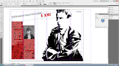
Here I added the same pattern of my contents page onto my double page spread, I used this behind my text instead of a blank box to make the page more eye catching as well as keep a constant theme going throughout my three pages; Thresholds, Black and White or Red
Here I began to make my final image for my double page spread, I chose a drum set because I had to put more music related images in my magazine. I started to remove the text with the 'Spot Healing' tool, then, to keep with the theme, I made the image monochrome.
This is the final product of my Double Page Spread, I decided to make the central image the main focus of the page with the text being based around the "Artist" featured in the image, this is similar to other double page spreads I studied, I made sure my typography and imagery suited the theme I went for in the rest of my magazine.


this is a far better post, it details design decisions better and is far more comprehensively annotated, there are still some screen shots without annotation, you also need to revisit older posts and re- annotate in a similar manner
ReplyDeleteyou have held a target audience interview which I know has influenced your final design and its development... make sure that youi have addiong the changes you made and that this was in response to the responses your TA voiced
ReplyDelete